
2018 MAGAZINE WINNERS
Category No. 22: Printed Magazine
MILLBROOK SCHOOL
Millbrook, NY USA
Grades 9 -12, Coed Boarding

CLICK TO OPEN
SAMPLE JUDGES' COMMENTS
This cover is just so great — it immediately invites you in to learn more. The front of book photography double-truck spreads are just amazing looking. I appreciate that there's a section up front that's branded out loud "academics." Fantastic photography throughout. Love the "Only at Millbrook" feature serving as an instant differentiator/value proposition. RIS2C is really well done — a great, visual, easily navigable explanation of new programming. Love the Astronomy piece on the reinvention of its curriculum with a historical tie-in! Fantastic feature story introduction photo, I love this whole package, great design, graphics and alternating fonts to break things up, comprehensive look at a topic through students, faculty, curriculum, alumni in tech fields, fantastic! Absolutely love the design of Class Notes — you actually want to look through them rather than skip them!
The design of this piece is fantastic. I loved the cover photo and enjoyed the story it related to very much. The size, the photos and the finish on the piece made it easy to read the interesting content. Excellent!
Millbrook’s six stunning full bleed photo spreads that open the magazine grab your attention immediately with captions providing micro-stories on different elements of school life.Then comes the cover story “Screentime and Millbrook Students,” and an extensive cluster on technology with strong presence of alumni in these pages. Millwork’s photography is outstanding. It is clear that thought goes into content development, an essential of careful planning.The magazine is a little daunting at 108 pages, but packed with interesting content.
TEAM
Michelle Blayney, Editor
Alex Pearson and Trish Rexhouse, Assistant Directors of Communication
Kandice Zakarian, Photographer and Photography Coordinator
Proof Design, Design
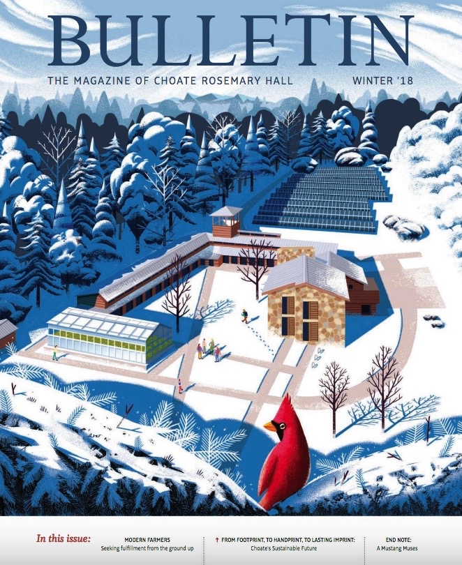
CHOATE ROSEMARY HALL
Wallingford, CT USA
Grades 9-12, Coed Boarding and Day
CLICK TO OPEN
SAMPLE JUDGES' COMMENTS
Special congratulations go to the school, one of the few who produce their magazine completely in-house. This has been a strong magazine for several years, and it is a pleasure to bestow my award to the Bulletin.
Fresh, modern, clean, really well done. Great pieces on sustainability, modern farmers, tying in alumni. Love the cover. Terrific.
The cover is just amazing, and the illustration quality and imagination is carried through to the cover story introduction. A fantastic way to make an institutional initiative story engaging! I really like that the magazine keeps a consistent content theme — and institutional differentiator, profiles of alumni in a common industry, and at least one piece from a community member. I like that the features also take a whole-school approach to include points of view from the institution, students, faculty, and alumni. Great job on the cover story design with factoids, infographics, block quotes and lots of white space. It makes a long piece look less daunting. And for an issue about sustainability, nice job pointing the reader toward prioritizing the environment when it comes to the production of the magazine itself!
TEAM
Alison J. Cady, Director of Strategic Planning & Communications
Lorraine S. Connelly, Associate Director Communications and Editor, Choate Rosemary Hall Bulletin
David Nesdale, Design
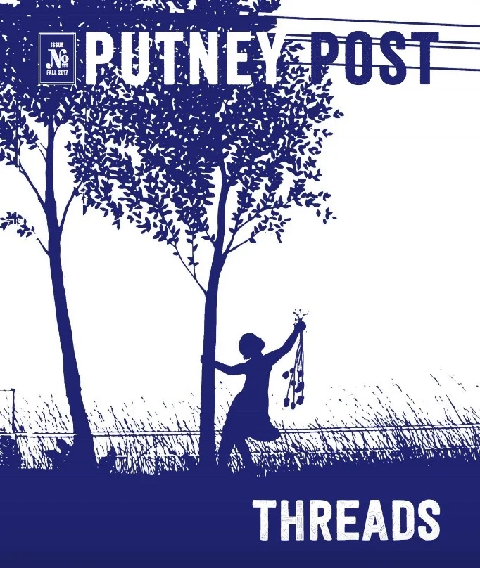
ALDEIA FOR
PUTNEY SCHOOL
Putney, VT USA
Grades 9-12, Coed Boarding and Day
CLICK TO OPEN
SAMPLE JUDGES' COMMENTS
This is an exceptional example of cohesive storytelling throughout an issue; the "theme issue" is so often a trap, but here we see it done right. The cover is gorgeous and compelling from the editors note forward, the reader is engaged in a story that feels deeply authentic to the school that produced it.
Putney School’s magazine is bold editorially and strong visually. This magazine could only come from a very creative school. One of the few saddle stitched magazines I saw, this one is beautifully produced and printed and carefully curated round the “Threads” theme.I particularly liked the mini student profiles and photos, showing readers their individual and eclectic styles.
TEAM
Alison Frye, Editor
Lilly Pereira / aldeia, Design
Category No. 23: Magazine Cover Design
SUN VALLEY COMMUNITY SCHOOL
Sun Valley, ID USA
Grades PS-12, Coed Day and Boarding
CLICK TO OPEN
SAMPLE JUDGES' COMMENTS
Hands down my favorite. I want to be there! Hang’n out with those people, warming up around the fire, hearing the river behind me. Great shot — real sense of place and experience. Text is good too. The red cross reminds me of mountain rescue. Whole thing feels adventurous.
GOLD: This was a clear standout. I don't know anything about Sun Valley Community School, but I can see they love the outdoors and take advantage of their location. The simple tagline and bold magazine title are great as well.
Striking imagery. Makes me want to learn more.
TEAM
Britt Johnston, Graphic Design
Oliver Guy, Photographer
MCDONOGH
Owings Mills, MD USA
Grades K -12, Coed Boarding and Day
CLICK TO OPEN
SAMPLE JUDGES' COMMENTS
Beautiful and intriguing photo. Composition in color and texture is stunning.
I love how this cleverly cropped photo draws you and asks to investigate further. The colors and the clean masthead are the icing on the cake.
Love the simplicity of the image and the cover. The photo is bold and unexpected.
TEAM
Nina Sinnott, Director of Communications
Meredith Bower, Associate Director of Communications
Heather McPeters, Creative Director
Dave Radford, Digital Content and Social Media Specialist
Noreen Lidston, Communications Associate
Sherry McAllister, McAllister Design
CROSSROADS SCHOOL FOR ARTS AND SCIENCES
Santa Monica, CA USA
Grades K -12, Coed Day
click TO OPEN
SAMPLE JUDGES' COMMENTS
The shapes created by the girls are eye catching and they're all giving direct eye contact to the reader so it's engaging. Sometimes less is more and they've captured that here.
Striking photography that goes well with the magazine header, and creates a sense of sections within the photo itself. Nice introduction to the theme of the magazine.
TEAM
Jeff Goodman, Communications Manager
Sara Ring, Director of Communications
Chris Flynn, Photographer
The Warren Group | Studio Deluxe, Graphic Designers
Category No. 24: Magazine Feature Article Design
CHOATE ROSEMARY HALL
Wallingford, CT USA
Grades 9-12, Coed Boarding and Day

CLICK TO OPEN
SAMPLE JUDGES' COMMENTS
Such a wonderful and clean design. You draw the reader in with striking imagery and deliver on a strong and well written article that is interesting and goes beyond the typical school magazine article. Great job.
Gorgeous photos, fresh look, "modern" typography to compliment interesting subject matter.
Great use of white space. Photography was engaging on every page. Pull quote fonts and colors added to the earthy feel. Great job!
TEAM
Lorraine S. Connelly, Editor
David C. Nesdale, Design
Alison J. Cady, Director of Strategic Planning & Communications
LA JOLLA COUNTRY DAY SCHOOL
La Jolla, CA USA
Grades PS-12, Coed Day

CLICK TO OPEN
SAMPLE JUDGES' COMMENTS
The combination of graphic elements, artwork, white space, font selection and photography made this a clear winner.
Strong headline, subheads and text were accented with wonderful design details. I knew that this was a winner for me when found it interesting enough to discuss in detail with a colleague.
TEAM
Tiffany Tran, director of marketing and communications
Rachael Baxter, digital media and design coordinator
Jennifer Fogarty, communications content manager
Lauren Vajda, art director and designer
RIDLEY COLLEGE
St. Catharines, ON, Canada
Grades K-PG, Coed Boarding and Day

CLICK TO OPEN
SAMPLE JUDGES' COMMENTS
Beautiful photography, interesting article composition between content, photo, and recipe.
Its color is appealing and well photographed. I like the lay out, each page is different, the font/text interesting.
The intro spread was very well designed. I wanted to jump and read! (I wish I had been smart enough to design the "alumni @ work" graphic.) What a great idea to add recipes to each alumni story. Everything about this was well done.
TEAM
Andrea Carisse, Director of Strategic Communications & Marketing
Michelle Scrivener, Graphic Designer & Photographer, Communications
Mackenzie Fowler, New Media Coordinator
Angela Osborne, Writer and Media Relations Coordinator
