
How To Create An Award-Winning Logo & Special Event: Shanghai American School
/Chosen because Shanghai American School tied for Silver in the 2019 Brilliance Awards for Special Event and snagged a Bronze for Logo. Director of Marketing and Communications Kevin Lynch tells us about these projects.

“Stunning visuals in a powerful document. The minimalist approach helps viewers focus on the message. Very well done!”
Logo

CLICK TO OPEN
“Beautiful in every way! The colors are strong and the logo design and font distinctly say Art Deco. Their SAS monogram is a great idea and reminds me of vintage passport stamps!”
The Challenge
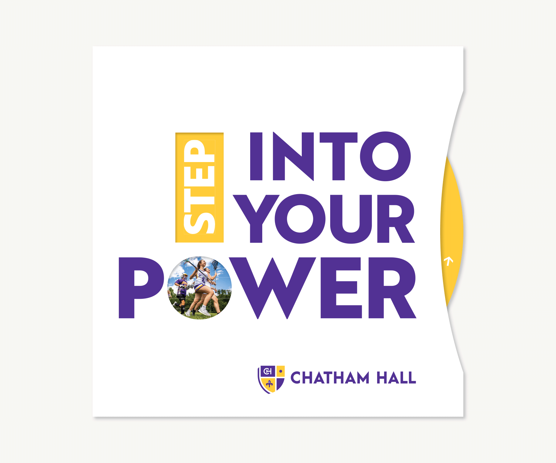
In spite of a long history that began in 1912, Shanghai American School didn’t have the basic elements of a brand identity system. Their goal, quite simply, was to give themselves the tools and visual lexicon to communicate consistently and distinctly.

“It was critical to look at this design project not as a logo design, but as the creation of an identity system.”
The system needed to capture all that is SAS – it needed to embrace East (their Shanghai location) and West (their American roots), and balance its rich history with its future-forward energy. And of course, it needed to provide a seamless transition across all print, digital, and environmental materials.
The Strategy
“It was critical to look at this design project not as a logo design, but as the creation of an identity system,” says Kevin Lynch, Shanghai American School Director of Marketing and Communications. “It was valuable to work with partners who could look at the school from a systematic perspective, as well as an outside perspective. After all, our primary audience is an external one – prospective families.
Choose a Partner
SAS chose Firebelly, a design firm in Chicago that made the trek to Shanghai more than once for this project. “They lived among us, and soaked up the quieter, pre reflective moments as well as the formal ones,” says Kevin. “We’d suggest doing the same. Camp out as long and often as possible – if only for the free lunches.” To pay for the visual identity, the school increased its budget .5% over three years. After an intensive 10 months, the new identity was rolled out during a Founder’s Day celebration at the school.
The Results
“In an organization as complicated as a school, it’s difficult to isolate success metrics around an identity system,” says Kevin. “What is measurable — things like our Net Promoter Score (measuring community satisfaction), application numbers, and merchandise sold in our Eagle Shops — have all shown dramatic increases since the rollout.”
TEAM
Firebelly Design
SAS Marketing + Communications team
Special Event: The First 100
“Great job in creating an anchor and legacy for alumni athletes.”

the first 100 poster
The Challenge
Shanghai American School has had incredible success in their activities conference, APAC (Asia Pacific Activities Conference). So much success, in fact, they were taking it for granted. Because as the school piled up championships, they hadn’t really catalogued how many they’d won. Kevin says, “Once we did a rough count, we realized we were nearing 100 – and that called for celebration! The First 100 was more than a celebration of a 100th championship – it was a recognition of the 99 before it.”
“More importantly,” says Kevin. “It helped our community understand that at SAS, they’re part of a larger story. At international schools, students, teachers, and leaders come and go so rapidly, you view the school in the small window when you were there. We want to make sure people broaden their apertures to view SAS in a bigger context.”
“This could’ve easily been viewed as a single-event celebration. Instead, with the Legacy Pins, we’ve created an ongoing tradition — one that everyone can be proud of.”

The first 100 pins
The Solution
The work for The First 100 takes advantage of the school’s well-designed brand identity system. The First 100 poster utilizes the strong gridded structure, clean typography, and gorgeous iconography of its various sports. And the pins utilize the school’s customized font in a simple, elegant manner.
The poster was given to all the athletes and coaches who had been a part of the First 100 APAC championships.
“But our favorite part is this: We produced pins for the team that won the 100th championship,” says Kevin. “The pin simply says ‘100’ in our unique SAS font. We also produced pins that said 101, 102, 103, etc. Now, each team that wins a championship at SAS earns a ‘Legacy Pin’ with their corresponding championship.” SAS is up to 115 and counting so far.
The Results
Kevin says, “This could’ve easily been viewed as a single-event celebration. Instead, with the Legacy Pins, we’ve created an ongoing tradition — one that everyone can be proud of.” Students love them. Parents are proud. Job done!
TEAM
Abe Zieleniec
SAS Marketing + Communications team
Congratulations, Shanghai American School! You are brilliant!
Want more brilliant ideas and brain food to make your job easier? Sign up here.


![How To Create An Award-Winning [Anniversary] Magazine: Cardigan Mountain School](https://images.squarespace-cdn.com/content/v1/57532abf27d4bd17be970a61/1648569270513-JR73OVUH159CUU8B5CU9/14Cardigan.jpg)


Master Electrician, InspirED School Marketers
Master Electrician isn’t just a fun title for me. It’s how I feel about sparking school marketers to do their best work, connecting them to one another, and helping to make their jobs easier. After working with close to 100 schools in the firm I founded — Turnaround Marketing Communications — I realized that school marketers needed a place where they can find brilliant ideas and brain food to make their job easier and feel supported. InspirED School Marketers was born in 2013 to fill that void and with the help of my fabulous Best Boy, Rob, we are on a quest to make InspirED a resource you can't live without.
Twitter Facebook LinkedIn