
How To Create An Award-Winning Logo: DiGiovine Design and Oakwood School
/Chosen because DiGiovine Design won Silver for Logo for their client, Oakwood School. We talked with Adrienne DiGiovine, Principal, DiGiovine Design to learn more.

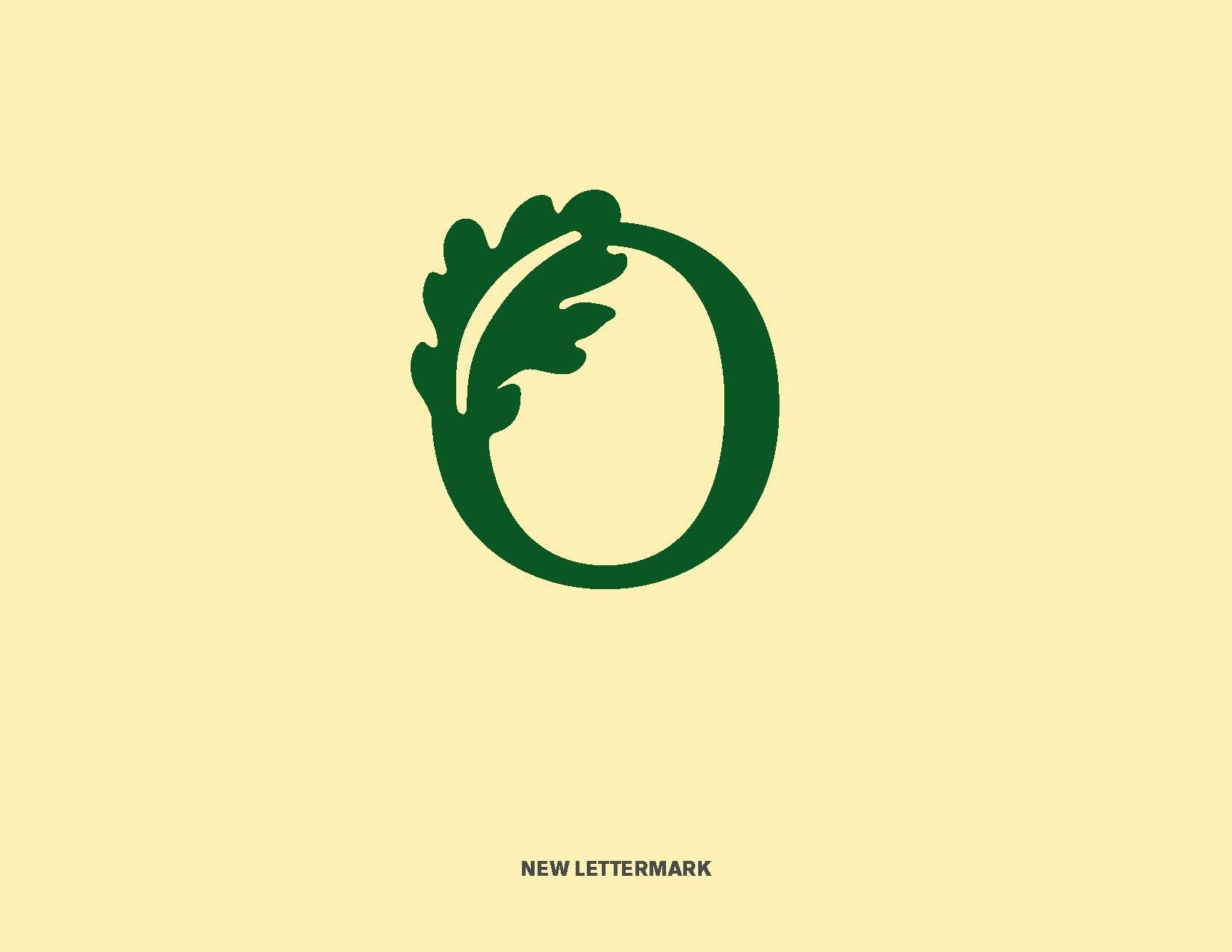
“As a school with an oak tree as a mascot, I truly appreciated the treatment of the oak leaf lettermark. Embedding the leaf into the O for Oakwood is a new and appealing text treatment. Bravo to Oakwood’s design team!”
School logo: to change or not to change
Private school logos occasionally stand the test of time and are used for decades upon decades. More often, though, a school logo needs a refresh or a complete redesign because the school has changed something about their brand, the logo isn’t functioning well, or it’s plain old tired and doesn’t reflect well on the institution. Or perhaps there is no one school logo, and the school’s graphic identity is all over the map.
Understandably, private schools don’t enter into a logo change lightly. First, it’s expensive. Even if the design of the logo itself isn’t, changing everything from uniforms, to signage, to swag is. Second, the school is bound to hear wails of despair from alumni/ae, long standing supporters, and/or current faculty. Change is hard, and, for some, changing a logo changes the entire perception of the brand. Entreaties about the new logo may include, “That’s not the school I know;” “I hate the new colors;” “Why would you mess with a good thing?” etc.
The Challenge

The Oakwood School Crest — Still in use.
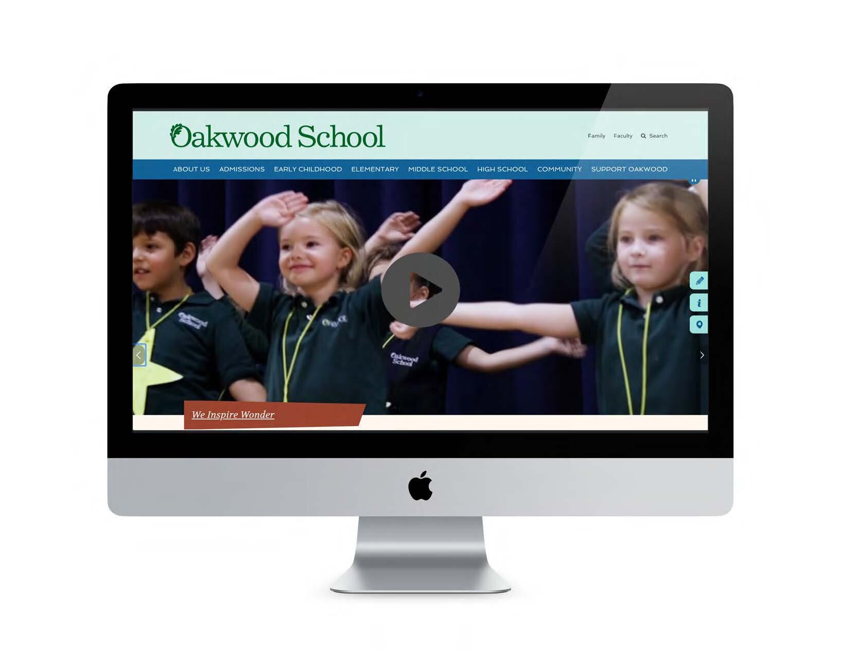
Oakwood School is a preschool through Grade 12, coed day school in Morgan Hill, California. While the school had a logo, “Oakwood School’s existing logo was not working for them,” says Adrienne DiGiovine, principal at DiGiovine Design.
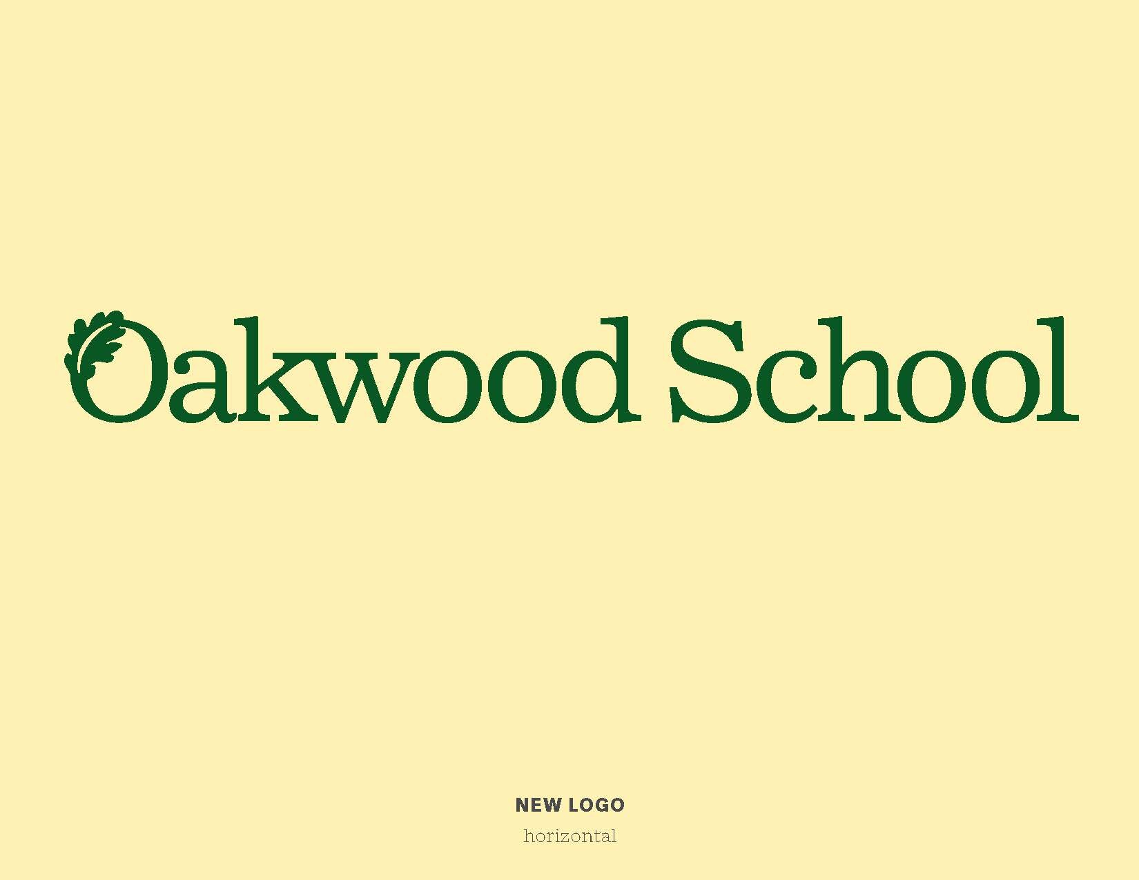
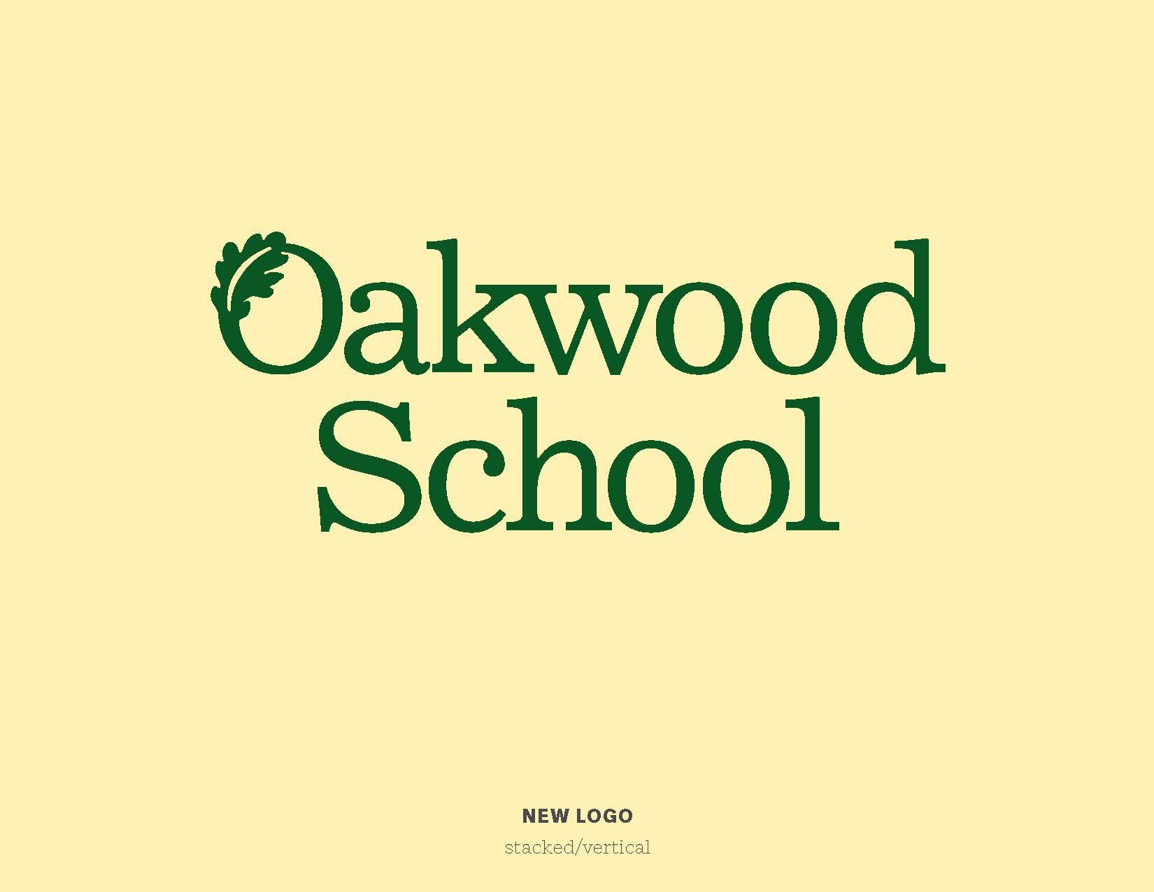
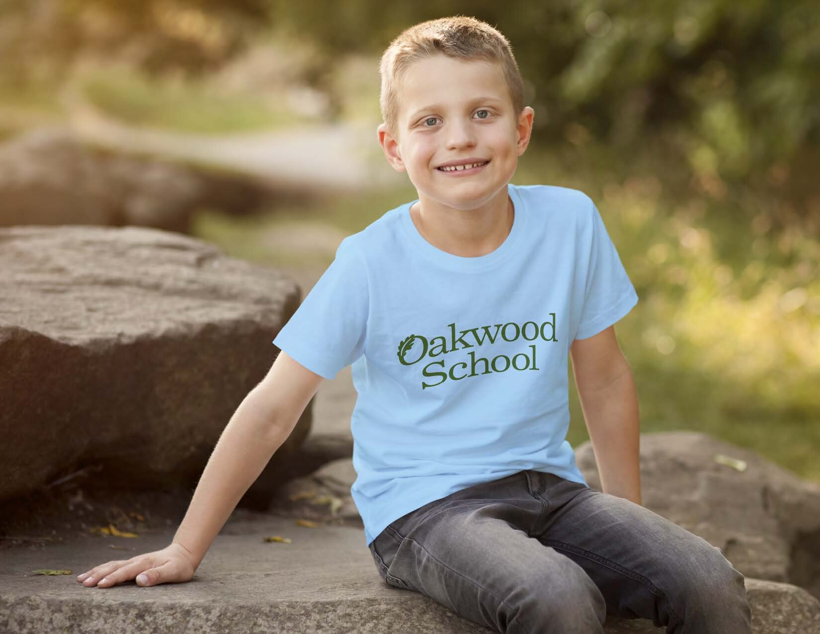
Graphic designers know that a well-designed logo should, among other things, reproduce well using any and all media. Oakwood School knew that their existing logo was difficult to reproduce. It incorporated a gradient, which set off the oak leaf that wove through the letter “O”, but caused reproduction problems.
Because of this challenge, members of the community sometimes didn’t use the current logo, resorting instead to an older logo that reproduced more easily, or using the school crest, which was meant for only formal applications. To complicate matters, the school community favored an earlier logo that wove the leaf through the “O” and used it as the first letter in the word, “Oakwood,” which read to many as “Akwood.”
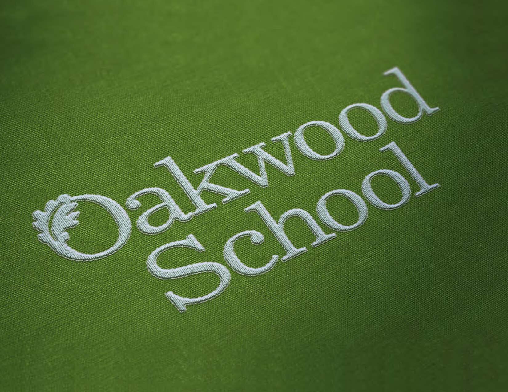
The goal was to redesign the school logo so it could be used effectively and simply using a wide range of applications such as embroidery, screen-printing, murals, signage, printing, digitally and much more.

“Many great logos are not complex or highly illustrative, but simple and understated.”
The Strategy
Oakwood School had been working with DiGiovine Design for many months on other projects such as direct mail, ads, summer camp brochure, and capital campaign logo. When the need for a new school logo arose, DiGiovine Design was a perfect fit.
The strategy was to present a series of logos incorporating an oak leaf. At the request of the client, at least one version had to incorporate an oak leaf in the first letter of the word “Oakwood.”
Adrienne’s advice for logo development is:
Establish goals at the outset and let them lead the way.
Don’t try to combine one from column A and one from column B.
Keep it simple. Many great logos are not complex or highly illustrated, but clean and easily reproduced.
Make sure it’s versatile. A good logo should function on many levels, platforms, and at a variety sizes.
The winning design should “feel” right. Over time, an organization’s logo will communicate its brand.
Christina Nyquist, Oakwood School’s Communications Director, used to run a creative agency with her husband. “Christina really gets design and makes the process of presenting ideas and whittling down to the finalists, easy,” says Adrienne.
The making of an award-winning school logo.
The Process
“I produced a series of ideas in Adobe Illustrator and presented them alone and on mockups, showing all the logos in Oakwood’s primary green color, horizontally and stacked, and mocked up on a white shirt,” says Adrienne. “I also presented the oak leaf interacting with the letter O as a letter mark, alone.”
Adrienne and Christina worked closely together and had one conference call with the entire committee which advanced the project well.
“An important thing to note about logo design is that the client isn’t paying for the time it takes the designer to create it, but the value of the logo.”
The Budget and Timeline
The price of a logo design varies greatly, not only because the designer can set the fee according to their market, but also because of what’s included in the package.
An important thing to note about logo design is that the client isn’t paying for the time it takes the designer to create it, but the value of the logo. An institution’s logo will be used for decades, in digital and print applications, in uniforms and spirit wear, on signage and on buildings, etc. We could list 100 applications here and still not be done. The logo becomes the school’s identity and its brand in the most basic sense of the word. It is difficult to put a value on a logo, and that’s why the range of fees to design one varies so widely.
What’s in the package? Digital files for sure. Beyond that the package may include a style guide that is super simple, or a more complex one involving an additional color palette, editorial styles, athletic logo(s), guides for letterhead and other applications, examples of how not to use the logo, brand messages, tag lines, official names of buildings and much more. Whatever is included, it should be part of the pre-determined scope of the project.
In Oakwood School’s case, “The budget for the school logo was determined,” says Adrienne. “Afterwards, we defined Oakwood’s athletic style (symbol, wordmark, and typeface) for an additional amount.” School logo development from first comps to final design took about two months.
Oakwood school’s campaign logo
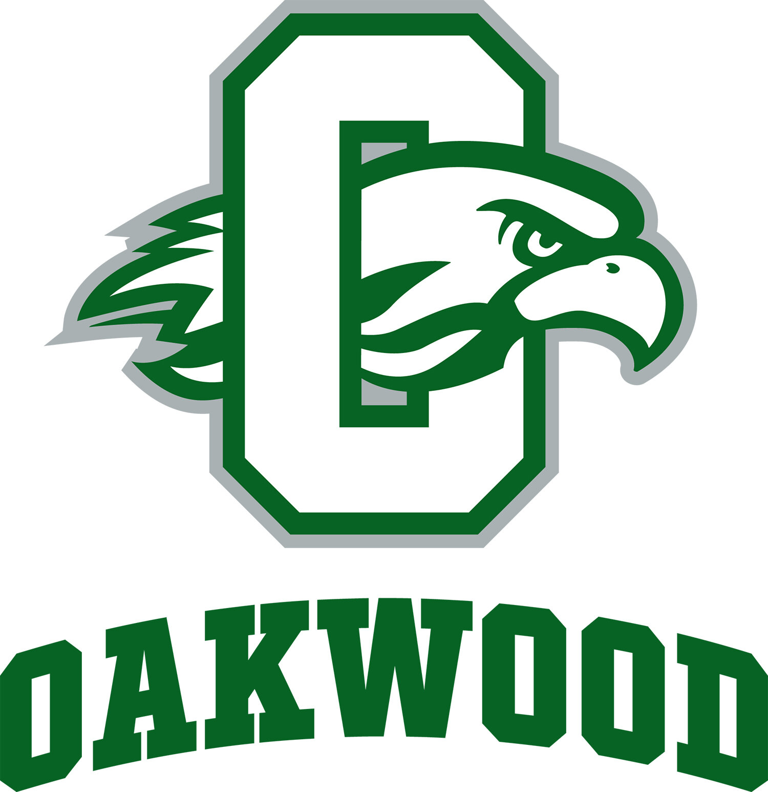
oakwood school’s 2-color athletic logo
About the Brilliance Awards win
DiGiovine Design was thrilled to have won a Silver Brilliance Award. “Although,” says Adrienne, “simply working with Oakwood School is enough fun, award or no award.” The Oakwood folks said on DiGiovine Design’s Instagram, “Congratulations! It is always a pleasure to work with you. Thank you for listening to what we need and providing successful solutions every time!”
TEAM
Adrienne DiGiovine, DiGiovine Design
Michelle Helvey, Head of School, Oakwood
Joan Hayden, Administrative Director
Christina Nyquist, Communications Director
Want more brilliant ideas and brain food to make your job easier? Sign up here.


![How To Create An Award-Winning [Anniversary] Magazine: Cardigan Mountain School](https://images.squarespace-cdn.com/content/v1/57532abf27d4bd17be970a61/1648569270513-JR73OVUH159CUU8B5CU9/14Cardigan.jpg)


Master Electrician, InspirED School Marketers
Master Electrician isn’t just a fun title for me. It’s how I feel about sparking school marketers to do their best work, connecting them to one another, and helping to make their jobs easier. After working with close to 100 schools in the firm I founded — Turnaround Marketing Communications — I realized that school marketers needed a place where they can find brilliant ideas and brain food to make their job easier and feel supported. InspirED School Marketers was born in 2013 to fill that void and with the help of my fabulous Best Boy, Rob, we are on a quest to make InspirED a resource you can't live without.
Twitter Facebook LinkedIn