
2017 Brilliance Awards Magazine Winners
Category No. 22: Printed Magazine
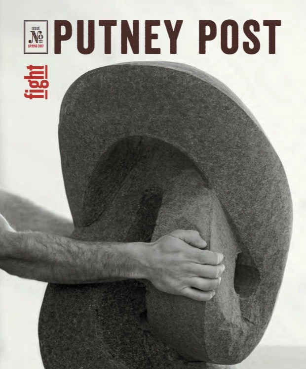
CLICK TO OPEN
ALDEIA FOR
PUTNEY SCHOOL
Putney, VT • Grade 9-12, Coed Boarding and Day
SAMPLE JUDGES' COMMENTS
Bold. Great stories. First rate writing. Daring layouts. A school magazine should reflect the tone and culture of its school. I have a true sense of Putney just from their magazine — a school bold enough to take 112 students to the women's march deserves a magazine equally as bold.
This magazine deserves to be a centerpiece on your coffee table. Spectacular photography, riveting stories, very clean — I couldn't put it down. On a side note, most magazines have a Head's letter on page two or three (right when you open the magazine). It's subtle, but notice that the Head's note is on page 23. Well after the alumni, faculty and student pieces. They have their priorities in order.
A stunning magazine where content, photography and graphic design come together in a sophisticated and elegant presentation that would walk off any newsstand. This is a magazine, not a scrapbook. Each spread has individuality and coherence. The concept of the magazine, which brings in voices of all members of the community, is well aligned with the spirit of Putney. Congratulations to the magazine team for publishing a magazine of top college quality.
From the eerie poem/photo on the inside front cover to the student-snapped campus shot on the last page, this magazine packs a big and refreshing punch. Not surprising, given the issue theme and title: Fight. It is personal and emotional but at the same time pragmatic and informational. All the regular magazine bits are here, but told in a compelling enough way that people who have no relationship to the school, like me, can be interested in it. The writing draws you in. The design is cohesive, but each story has its own visual identity — some with vibrant photography, one (juxtaposing a prosecutor's and defense attorney's take on justice) forcing the reader to view the piece — virtually all copy — from a different perspective literally, because you have to turn it sideways to read it.

CLICK TO OPEN
SILVER
STOLTZE DESIGN FOR
MILTON ACADEMY
Milton, MA • Grades K-12, Coed Boarding and Day
SAMPLE JUDGES' COMMENTS
This magazine is full of interesting stories that highlight and market the school well. Although chock-full of content, the designed is clean with the good use of white space. What an interesting approach to position the feature stories toward the front to attract and engage the reader early on.
This magazine is kin to the top tier of entries in this competition.
This gets high marks because the features are very well written and quite interesting. They would make me proud to be a graduate of the school. It feels appropriately impressive and established.

CLICK TO OPEN
BRONZE
WESTTOWN SCHOOL
West Chester, PA • Grades PK-12, Coed Boarding and Day
SAMPLE JUDGES' COMMENTS
This magazine deserves an award for its excellent content and graphic design, nice tip of the hat to facilities and grounds crew and a major piece on sustainability. Inclusion of the annual donor report and impact numbers was handled skillfully and saves a bundle on postage. Again, we found photography to be exceptional.
The cover draws you in. And while the green revolution story and the piece about the retiring head of school were excellent at giving the reader a feel for the core values the school embraces, it was the cover that kept bringing me back to this magazine.
Courageous to take on the election aftermath; loved the tree feature.
Category No. 23: Digital Magazine

CLICK TO OPEN
ALMANAC FOR
MICDS
St. Louis, MO • Early Childhood - Grade 12, Coed Day
SAMPLE JUDGES' COMMENTS
Writing for the web requires a deliberate approach that blends visual elements with compelling, scannable prose. MICDS' online magazine reflects a solid understanding of those principles.
Wow, the 75-year timeline must have taken you 75 years! So impressive. So much wonderful content here for your community and displays nicely online.
Compelling design; interesting features.

CLICK TO OPEN
SILVER
ROWLAND HALL
Salt Lake City, UT • Age 2 - Grade 12, Coed Day
SAMPLE JUDGES' COMMENTS
So much terrific content here and it's well organized. The reader can find it easily. Wonderful photography, well written. Great job!
The alumni news section and some of the People articles were the strongest in terms of content. Kudos for pulling together so many stories for one issue.

BRONZE
(No Winner)
Category No. 24: Magazine Cover Design
CLICK TO OPEN
M CREATIVE FOR
RAVENSCROFT SCHOOL
Raleigh, NC • Grades PK-12, Coed Day
SAMPLE JUDGES' COMMENTS
Love the concept and execution. The design immediately draws your eye to the text.
Creative in typography, design, content and beautifully executed. The use of the illustrated message succeeds in effectively communicating the report's message, conveying its goals and achievements.
Nice design/illustration with an old school feel and getting a lot of information on the cover in a readable way. Clever.
CLICK TO OPEN
SILVER
WESTTOWN SCHOOL
West Chester, PA • Grades PK-12, Coed Boarding and Day
SAMPLE JUDGES' COMMENTS
Stunning visual that clearly represents the story. Beautiful photography and artistic rendering that brings to life "Global Education at Westtown." Perfect choice of the clean, sans font used that doesn't interfere with the complexity of the surronding image.
I love covers that are non-traditional and do not follow a template of simple photo and title header. I am drawn in by the image and would like to read more. Very effective.
This was the best combination of an interesting and compelling photograph and brief copy which explained the cover image.
CLICK TO OPEN
BRONZE
M CREATIVE FOR
RAVENSCROFT SCHOOL
Raleigh, NC • Grades PK-12, Coed Day
SAMPLE JUDGES' COMMENTS
Imagine opening your mailbox to find this face — or at least nose — staring you down! I love this cover. It practically demands that you open it and find out more. What put this one over top is that the striking image was backed up by copy that tells a story in and of itself. The "seal" around the headline really was an excellent design touch!
An unusual subject for a school magazine cover captured with a wonderful 'in your face' photo. The head-on perspective is what makes it work. A side shot of a cow would not have had the same impact. The image and the cover copy made me curious about the content.
In my opinion this cover was the best, combining a fun image with great typography and using limited text to contextualize the cover story and pull the reader into the issue.
